Let’s learn the basics of plotting with pandas to make things more interesting.
To get us started, we will use again the simplified data (glacial_loss.csv) from the National Snow and Ice Data Center (Original dataset). The column descriptions are:
year: calendar year
europe - antarctica: change in glacial volume (km3 ) in each region that year
global_glacial_volume_change: cumulative global glacial volume change (km3), starting in 1961
annual_sea_level_rise: annual rise in sea level (mm)
cumulative_sea_level_rise: cumulative rise in sea level (mm) since 1961
import pandas as pd# read in filedf = pd.read_csv('data/lesson-1/glacial_loss.csv')# see the first five rowsdf.head()
year
europe
arctic
alaska
asia
north_america
south_america
antarctica
global_glacial_volume_change
annual_sea_level_rise
cumulative_sea_level_rise
0
1961
-5.128903
-108.382987
-18.721190
-32.350759
-14.359007
-4.739367
-35.116389
-220.823515
0.610010
0.610010
1
1962
5.576282
-173.252450
-24.324790
-4.675440
-2.161842
-13.694367
-78.222887
-514.269862
0.810625
1.420635
2
1963
-10.123105
-0.423751
-2.047567
-3.027298
-27.535881
3.419633
3.765109
-550.575640
0.100292
1.520927
3
1964
-4.508358
20.070148
0.477800
-18.675385
-2.248286
20.732633
14.853096
-519.589859
-0.085596
1.435331
4
1965
10.629385
43.695389
-0.115332
-18.414602
-19.398765
6.862102
22.793484
-473.112003
-0.128392
1.306939
6.1plot() method
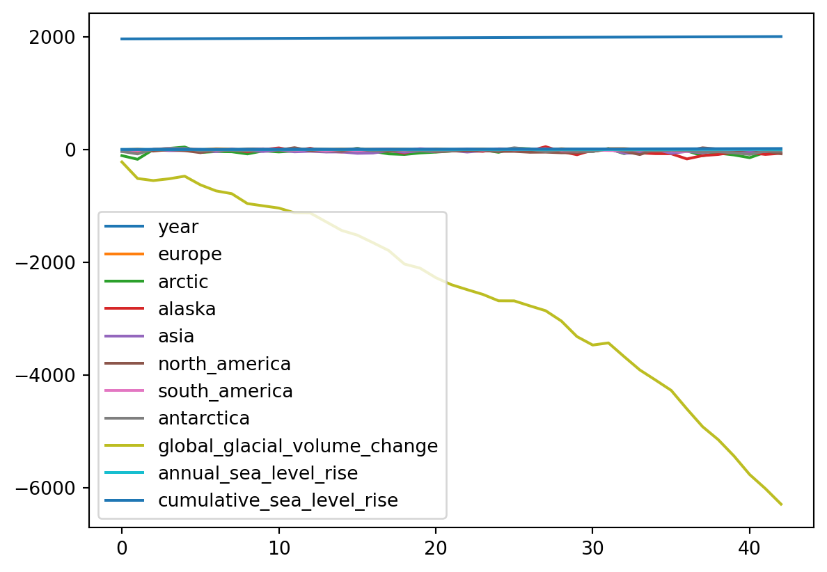
A pandas.DataFrame has a built-in method plot() for plotting. When we call it without specifying any other parameters plot() creates one line plot for each of the columns with numeric data.
# one line plot per column with numeric data - a messdf.plot()
<AxesSubplot:>
As we can see, this doesn’t make any sense! In particular, look at the x-axis. The default for plot is to use the values of the index as the x-axis values. Let’s see some examples about how to improve this situation.
6.2 Line plots
We can make a line plot of one column against another by using the following syntax:
df.plot(x='x_values_column', y='y_values_column')
For example,
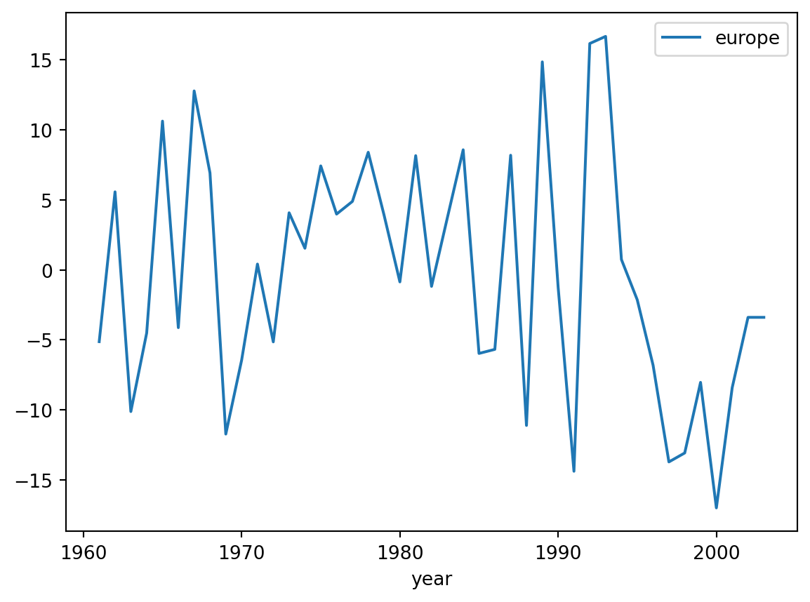
# change in glacial volume per year in Europedf.plot(x='year', y='europe')
<AxesSubplot:xlabel='year'>
We can do some basic customization specifying other arguments of the plot function. Some basic ones are:
title: Title to use for the plot.
xlabel: Name to use for the xlabel on x-axis
ylabel: Name to use for the ylabel on y-axis
color: change the color of our plot
In action:
df.plot(x='year', y='europe', title='Change in glacial volume per year in Europe', xlabel='Year', ylabel='Change in glacial volume (km3)', color='green' )
<AxesSubplot:title={'center':'Change in glacial volume per year in Europe'}, xlabel='Year', ylabel='\u200bChange in glacial volume (km3\u200b)'>
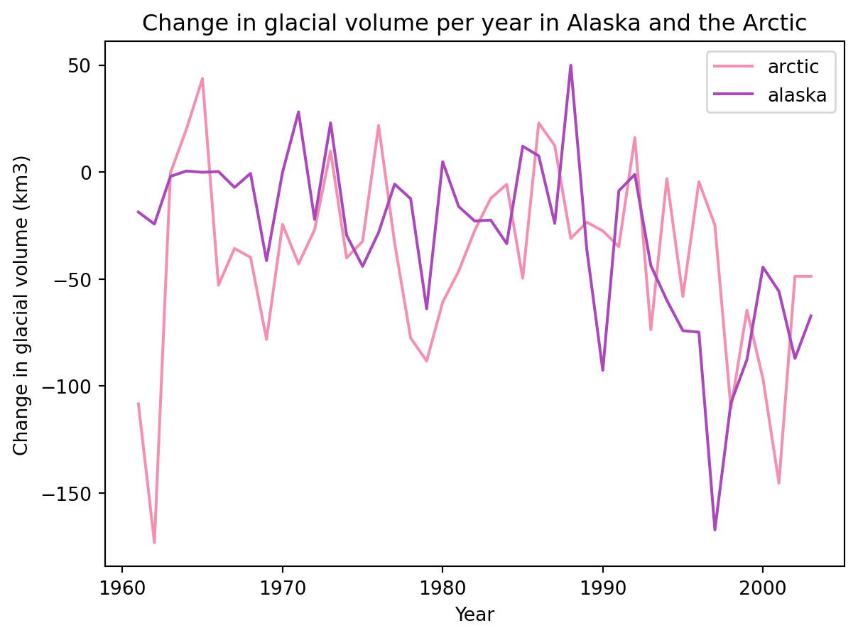
Let’s say we want to graph the change in glacial volume in the Arctic and Alaska. We can do it by updating these arguments:
y : a list of column names that will be plotted against x
color: specify the color of each column’s line with a dictionary {'col_1' : 'color_1', 'col_2':'color_2}
df.plot(x='year', y=['arctic', 'alaska'], title ='Change in glacial volume per year in Alaska and the Arctic', xlabel='Year', ylabel='Change in glacial volume (km3)', color = {'arctic':'#F48FB1','alaska': '#AB47BC' } )
<AxesSubplot:title={'center':'Change in glacial volume per year in Alaska and the Arctic'}, xlabel='Year', ylabel='\u200bChange in glacial volume (km3\u200b)'>
Notice that for specifying the colors we used a HEX code, this gives us more control over how our graph looks.
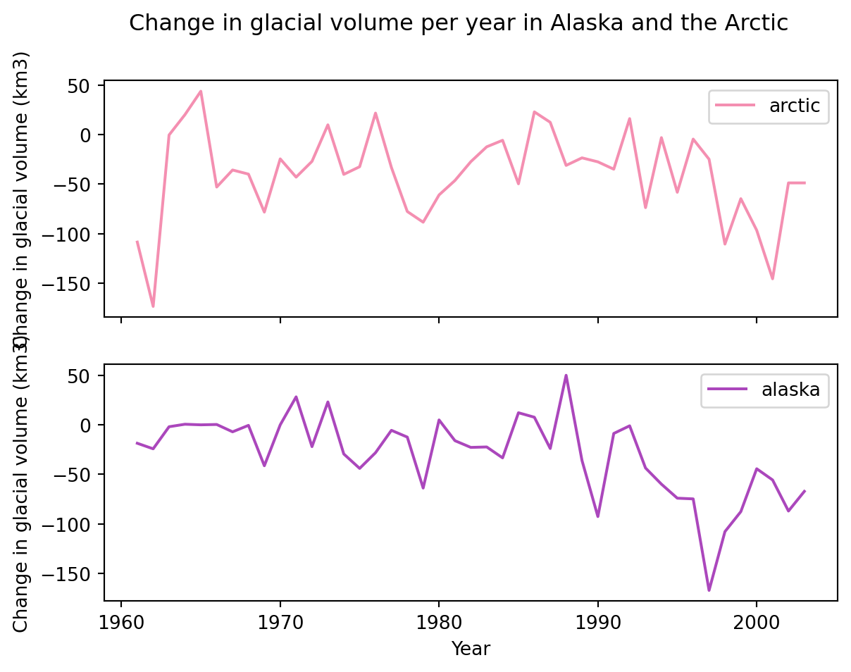
We can also create separate plots for each column by setting the subset to True.
df.plot(x='year', y=['arctic', 'alaska'], title ='Change in glacial volume per year in Alaska and the Arctic', xlabel='Year', ylabel='Change in glacial volume (km3)', color = {'arctic':'#F48FB1','alaska': '#AB47BC' }, subplots=True )
array([<AxesSubplot:xlabel='Year', ylabel='\u200bChange in glacial volume (km3\u200b)'>,
       <AxesSubplot:xlabel='Year', ylabel='\u200bChange in glacial volume (km3\u200b)'>],
      dtype=object)
6.2.2 Check-in
Plot a graph of the annual sea level rise with respect to the years.
What information is the columns variable retrieving from the data frame? Describe in a sentence what is being plotted.
We will move on to another dataset for the rest of the lecture. The great…
6.3 Palmer penguins dataset
For the next plots we will use the Palmer Penguins dataset (Horst et al., 2020). This contains size measurements for three penguin species in the Palmer Archipelago, Antarctica.
The Palmer Archipelago penguins. Artwork by @allison_horst.
The Palmer penguins dataset has the following columns:
species
island
bill_length_mm
bill_depth_mm
flipper_lenght_mm
body_mass_g
sex
year
Let’s start by reading in the data.
# read in datapenguins = pd.read_csv('https://raw.githubusercontent.com/allisonhorst/palmerpenguins/main/inst/extdata/penguins.csv')# look at dataframe's headpenguins.head()
species
island
bill_length_mm
bill_depth_mm
flipper_length_mm
body_mass_g
sex
year
0
Adelie
Torgersen
39.1
18.7
181.0
3750.0
male
2007
1
Adelie
Torgersen
39.5
17.4
186.0
3800.0
female
2007
2
Adelie
Torgersen
40.3
18.0
195.0
3250.0
female
2007
3
Adelie
Torgersen
NaN
NaN
NaN
NaN
NaN
2007
4
Adelie
Torgersen
36.7
19.3
193.0
3450.0
female
2007
# check column data types and NA valuespenguins.info()
We talked about how the plot() function creates by default a line plot. The parameter that controls this behaviour is plot()’s kind parameter. By changing the value of kind we can create different kinds of plots. Let’s look at the documentation to see what these values are:
pandas.DataFrame.plot documentation extract - accessed Oct 10,2023
Notice the default value of kind is 'line'.
Let’s change the kind parameter to create some different plots.
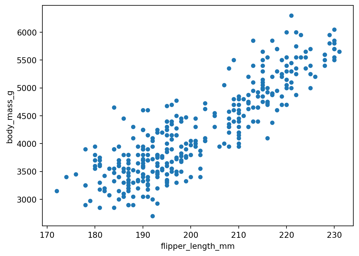
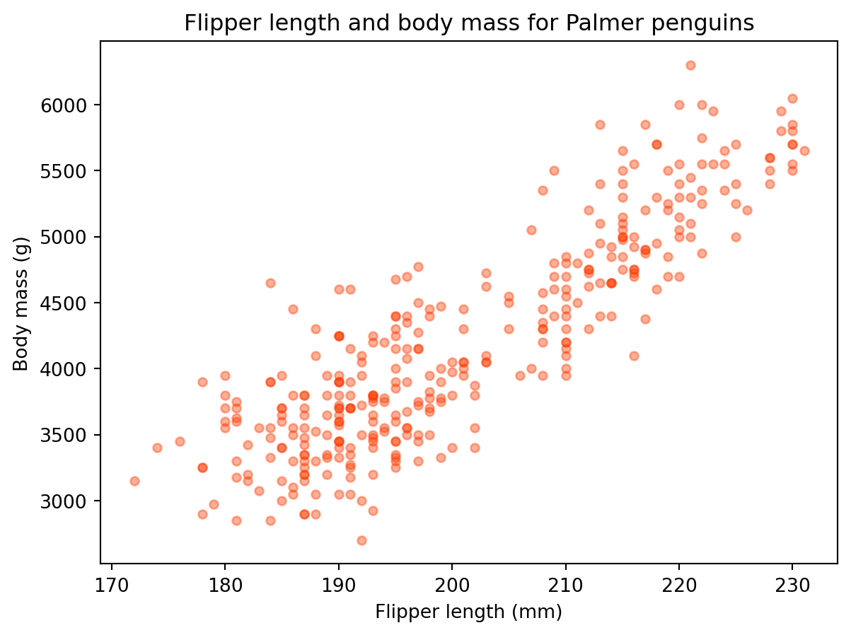
6.5 Scatter plots
Suppose we want to visualy compare the flipper length against the body mass, we can do this with a scatterplot.
We can update some other arguments to customize the graph:
penguins.plot(kind='scatter', x='flipper_length_mm', y='body_mass_g', title='Flipper length and body mass for Palmer penguins', xlabel='Flipper length (mm)', ylabel='Body mass (g)', color='#ff3b01', alpha=0.4# controls transparency )
<AxesSubplot:title={'center':'Flipper length and body mass for Palmer penguins'}, xlabel='Flipper length (mm)', ylabel='Body mass (g)'>
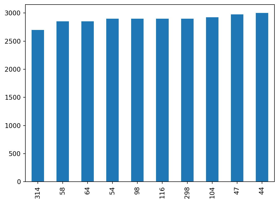
6.6 Bar plots
We can create bar plots of our data setting kind='bar' in the plot() method.
For example, let’s say we want to get data about the 10 penguins with lowest body mass. We can first select this data using the nsmallest() method for series:
If we wanted to look at other data for these smallest penguins we can use the index of the smallestpandas.Series to select those rows in the original penguins data frame using loc:
penguins.loc[smallest.index]
species
island
bill_length_mm
bill_depth_mm
flipper_length_mm
body_mass_g
sex
year
314
Chinstrap
Dream
46.9
16.6
192.0
2700.0
female
2008
58
Adelie
Biscoe
36.5
16.6
181.0
2850.0
female
2008
64
Adelie
Biscoe
36.4
17.1
184.0
2850.0
female
2008
54
Adelie
Biscoe
34.5
18.1
187.0
2900.0
female
2008
98
Adelie
Dream
33.1
16.1
178.0
2900.0
female
2008
116
Adelie
Torgersen
38.6
17.0
188.0
2900.0
female
2009
298
Chinstrap
Dream
43.2
16.6
187.0
2900.0
female
2007
104
Adelie
Biscoe
37.9
18.6
193.0
2925.0
female
2009
47
Adelie
Dream
37.5
18.9
179.0
2975.0
NaN
2007
44
Adelie
Dream
37.0
16.9
185.0
3000.0
female
2007
6.7 Histograms
We can create a histogram of our data setting kind='hist' in plot().
# using plot without subsetting data - a mess againpenguins.plot(kind='hist')
<AxesSubplot:ylabel='Frequency'>
To gain actual information, let’s subset the data before plotting it. For example, suppose we want to look at the distribution of flipper length. We could do it in this way:
# distribution of flipper length measurements# first select data, then plotpenguins.flipper_length_mm.plot(kind='hist', title='Penguin flipper lengths', xlabel='Flipper length (mm)', grid=True)
Select the bill_length_mm and bill_depth_mm columns in the penguins dataframe and then update the kind parameter to box to make boxplots of the bill length and bill depth.
Select both rows and columns to create a histogram of the flipper length of gentoo penguins.
6.8 References
Horst AM, Hill AP, Gorman KB (2020). palmerpenguins: Palmer Archipelago (Antarctica) penguin data. R package version 0.1.0. https://allisonhorst.github.io/palmerpenguins/. doi:10.5281/zenodo.3960218.